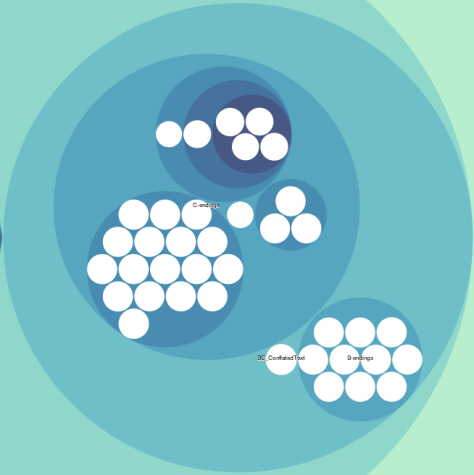
This is a circle packing diagram that, as a static image, doesn’t look like much.
Each of the white circles represents an individual Piers Plowman manuscript. Circles are ROUGHLY sized proportional to the number of lines of Piers poetry contained in each manuscript. Lines are estimated based on variations accounted for in the Kane editions and can be viewed in the JSON on the live bl.ock.
Grades of blue circles represent sub-categories of manuscripts based on the textual contents of each. Categorizations take note both of distinct combinations of A, B, and C text and of differentiations between how much text or how much of each are in a given sample of Piers Plowman.
[For those who are not Piers Plowman aficionados, the poem is generally acknowledged to exist in three distinct textual varieties that correspond to three different moments of composition or revision by the poet, William Langland. A, B, and C distinctions were bestowed upon the text(s) in the nineteenth century by the major editor and collator of the poem and its manuscript variants. Walter W. Skeat used “A,” “B,” and “C” to denominate not only the length of text, with A being shortest and C being longest, but also the order in which he supposed they were composed by the author, with A being earliest and C latest. Also, the Visio/Vita distinction is one that divides the first two dreams–which are relatively stable across all variations of the text–from the second set of more “internal” dreams that morph significantly depending on the version.]
What this diagram displays, more than anything else, is that A, B, and C may have been the authorial forms of the text, but the manuscripts contain a much more complicated set of mixtures of these textual contents.
Each time a larger group can be divided into two (or more) smaller groups based on a single textual distinction, two (or more) smaller circles appear within each subcategory. From the most zoomed-out position, then the first major distinction is most visible, and is the only distinction labeled on the diagram: that is the distinction between what I’m calling the “Short Text” and “Long Text.” By these two monikers, I’m simply referring to the groups of manuscripts that contain 2500 or fewer lines of Piers poetry versus those that contain 5500 or more lines.
Within each category, there are a number of subdivisions. Clicking on any one circle on the live diagram (at bl.ocks.org/ABSegler/8decedcc598ebd9d3c42) will zoom the view into only that circle and reveal another layer of additional data. Thus, clicking on the large, “Long Text” circle will bring into view:
Here we can see that there are three different categories that help us to distinguish between all the different kinds of long texts, and these categories are based on what kind of ending each manuscript’s poem contains: a B ending, C ending or a conflated ending with bits of both. Clearly, we can see that there is only one such “Conflated Text” and clicking on that circle zooms all the way in to reveal that it is Huntington Library Hm 114. Likewise, since the “B-endings” category doesn’t have any further subcategories, clicking on that circle will simply bring up all the names of the manuscripts belonging to that category. Clicking on the “C-ending” circle, however, will bring into view all the different shapes of the poem that make use of a C-ending, of which there are many.
And one can continue clicking and zooming to one’s heart’s content.
What is the point of all this? Well, aside from the fact that it’s fun and interesting, you can, in some sense, literally see all the manuscripts in a single glance! You can know what type of Piers text they contain (or mix together), and you can know how much Piers poetry is in each individual manuscript based on the relative size of each white node. You can also shift your gaze to varying levels of specificity that makes not only the “big picture” easy to see, but also adds more detailed information, including about each individual manuscript, as you express the desire to see it.
What I hope this brings into view is that the textual legacy of the Piers Plowman manuscripts is significantly more complicated and beautifully messy than the very clean delineations between the Langlandian A, B, and C texts would lead you to believe. Indeed, I hope that the variation and complexity evident in this zoomable diagram will lead you to come back and check out another data-graph next week.
Beyond that, I simply hope that the complexity of the corpus and the affiliations between different subgroups and varieties may pique enough interest to facilitate and promote further study.


This is brilliant! I’ve been imagining digital visualizations of the text of poem, but this map of the manuscripts is a great place to start. Are you taking requests or looking for ideas? Or looking for collaborators in building the visualizations?
Thanks for the enthusiasm. I am working on some text-mining visualizations, but most of my work is on highlighting the material manuscript corpus AND the different texts it instantiates. Some of the upcoming blogs are going to incorporate text-mining and textual visualizations, but I’m open to suggestions and I can see if I know how to do it. Or if you know how to do something already, perhaps we could have “guest blogs”!